
A purpose-built app addressing the vaping crisis among young adults by fostering accountability among friends.
View Hi-Fi Prototype
Designed for iOS

SOLUTION
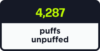
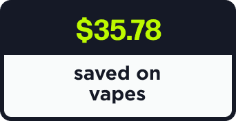
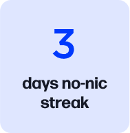
"Clean//Break" is an app designed to tackle the vaping epidemic among young adults (aged 18 to 25) by offering a platform to enhance accountability among friends. Users can customize their quitting reminders, monitor their progress, establish goals, compete, and ultimately quit nicotine for good.
TOOLS
Figma, Jitter, Google Workspace, Canva
TIMELINE
12 weeks
ROLE
UX Researcher, Design Strategy, UX/UI Designer
CONTEXT
During my 12-week UX Design bootcamp at BrainStation, I completed a capstone project where I successfully navigated all stages of the UX design process. My project was inspired by a prevalent issue within my social circles: the alarming reliance on nicotine vaping and the daunting challenge of quitting. Witnessing a significant rise in vape usage among young adults, I aimed to develop a solution that empowers them to break free from this habit for good.
PROBLEM
While rates of cigarette are in decline, the prevalence of electronic vaping has reached unprecedented levels. Many young adults aspire to quit vaping but face challenges such as physical dependency, easy access to vapes in their social circles, and lowered inhibitions during social drinking. Existing quitting aids often feel impersonal and even shaming to users, making young adults feel disconnected from their needs.
TL;DR
I began by conducting secondary research to gain a broader understanding of the problem space and which demographics are most affected by rising vape usage.
Striving for a deep understanding of the nicotine vaping landscape and why it's a problem worth addressing now.
SECONDARY RESEARCH
Presently, 20% of Americans aged 18 to 29 use vape products regularly.
Vaping amongst teens and young adults has surged by nearly 1,800% in the past decade.
From 2017 - 2022, the average nicotine strength of disposable e-cigs increased by 294%.
50mg/mL of nicotine
30mg/mL of nicotine
10mg/mL of nicotine
Sales of e-cigs with the highest level of nicotine (5%+) rose by nearly 15x in the same time.
Who is vaping & in what context?
Long-term health implications of vaping include increased risk of:
cardiovascular disease
lung damage
seizures
negative self-esteem
The human brain continues to develop until roughly the age of 25, so addiction to nicotine at a younger age disrupts critical brain functions like attention, learning, mood, and impulse control.
PAY TO THE
ORDER OF
DOLLARS
MEMO
DATE
$
960
00
The financial investment in vaping adds up quickly. The most commonly used nicotine vaping device amongst young adults are disposable vapes – making up over 55% of vape purchases.
The price range for disposables averages at $20, which amounts to an average cost of $80/month or $960/year.
What are the consequences of vaping regularly?
While many young individuals have the intention to quit, they grapple with challenges such as:
physical addiction
easy access to vape products through their social circles
Yet, it’s also true that most young adults are aware of the implications associated with long term vaping.
}
This revealed the dichotomy of the issue: that young adults have a strong desire to quit, but relapse each time they endeavor to quit themselves.
Are people trying to quit? Are they successful?
of young adults currently vaping intend to quit
54%
of young adults currently vaping are motivated to quit in the next month
13%
33%
of young adults currently vaping tried and failed to quit within the last year
In concluding secondary research, I synthesized the information into main assumptions about the user groups’ needs, current behaviors, and motivations.
Assumptions about the user group (derived from previous research) to help craft our interview script.
ASSUMPTIONS
I believe that young adults who are regularly vaping...
✷ Experience negative side effects from vaping nicotine
✷ Wish to quit vaping
✷ Have tried to quit vaping and failed at some point
✷ Use nicotine vapes in social settings
✷ Believe vaping is better than smoking cigarettes
✷ Struggle most with physical withdrawal as a barrier to quitting
✷ Primarily use disposables to vape
✷ Spend more money on vaping than they wish to
✷ Experience guilt using their vape
✷ Did not start vaping with the intention of continuing long-term use
Research goals help establish the information we aim to gain from user interviews.
The best way to determine whether my assumptions were true was to conduct user interviews with members of my user group. Below are the research goals used to streamline writing my interview script:
PRIMARY RESEARCH GOALS
Through the interview process, I’d like to better understand:
✷ If and when young adult vapers intend to quit
✷ What motivations drive young adults to keep vaping
✷ What potential motivations young adults have to quit vaping (i.e. health, finances, etc.)
✷ Reasons why young adults’ quit attempts have failed in the past
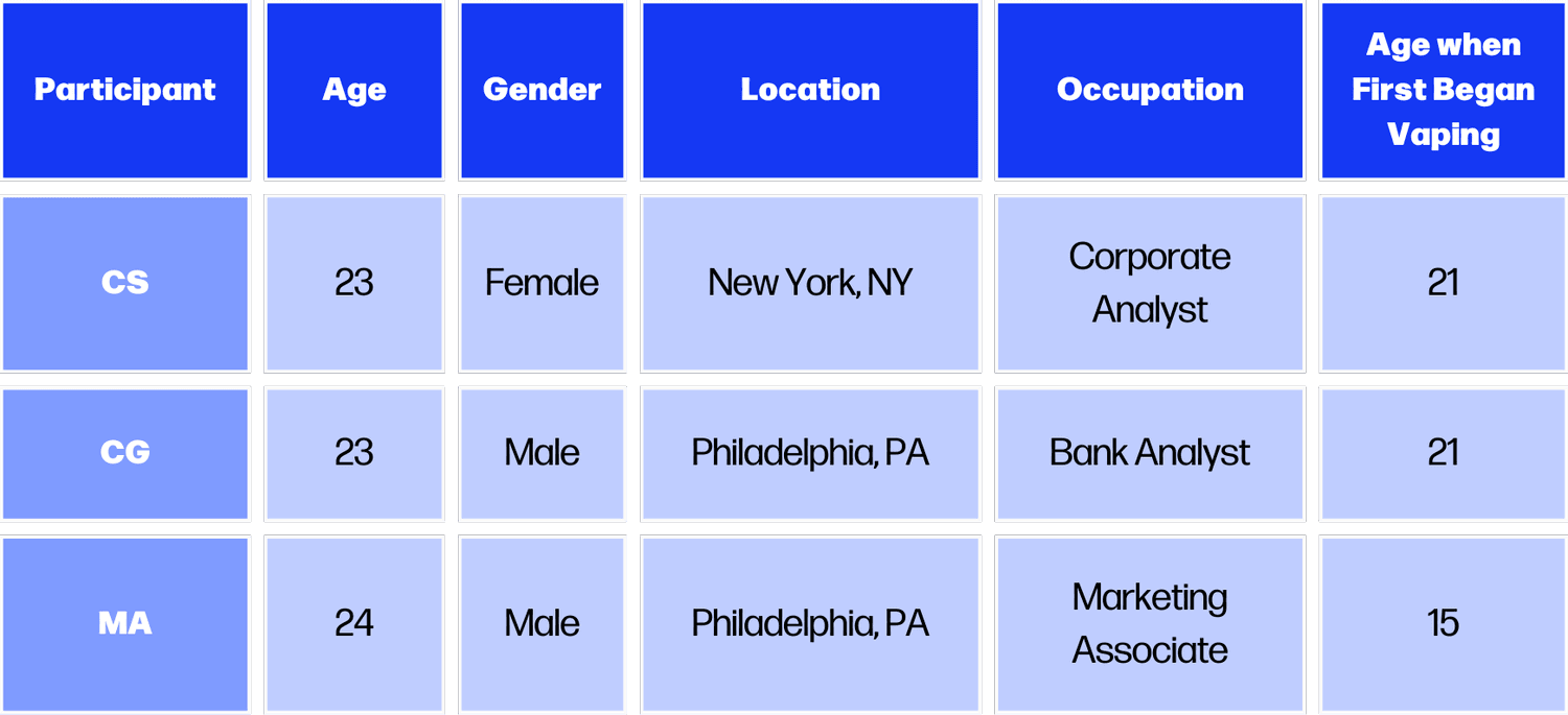
Three young adults between 18 - 25 years old who vape were interviewed. The term "who vape” is defined as having vaped more days than not within the last 3 months. I used the following interview script ->.
Three participants were recruited for user interviews to better understand the issue.
PRIMARY RESEARCH | USER INTERVIEWS
✷ Young adult living in the United States (ages 18 - 25)
✷ Regularly vapes (defined as having vaped more days than not within the last 3 months)
USER GROUP CRITERIA
Young adults cited physical cravings, social drinking, and access to vapes via friends as their biggest challenges while quitting.
#1
Young adults desired different tonal approaches in quitting aids: ranging from kindhearted advice to harsh realism.
#2
Young adults feel they’d find more success quitting if they did it simultaneously with a friend.
#3
What patterns were revealed?
“Vaping is my least favorite part about myself.”
-CS
“I usually cave when a friend of mine buys a new one - it makes it feel okay to keep vaping, too.”
-MA
“Thinking back on how often and how many [vapes] I’ve gotten, it’s a disgusting amount of money wasted.”
-CS
“I don’t like the feeling of being dependent [on my vape].”
-CG
I then analyzed the information collected from my three participants and turned each response into a unique behavior, motivation/goal, or pain point via the affinity mapping -> process. From there, I organized the data points into key themes, or common patterns and topics that emerged.
Synthesizing the current pain points, motivations, and behaviors of young adults who vape.
AFFINITY MAPPING & CHOSEN THEME
See More
PAIN
POINTS
GOALS + MOTIVAT-IONS
BEHAVIORS
LEGEND:
THEME: Personal Desire to Quit
“I recognize this is not something I should be doing with my life”
-CG
Wants to quit nicotine to be healthier
-MA
Feels motivated to quit vaping
-CS
“Vaping is my least favorite part about myself”
-MA
“I don’t like the feeling of [being dependent]”
-CS
“Thinking back on how often and how many [vapes] I’ve gotten, it’s a disgusting amount of money wasted”
-CS
THEME: Struggles with Quitting
Vapes the most socially and when drunk
-CS
Has attempted to quit multiple times unsuccessfully
-CG
Hits friends’ vapes when trying to quit
-MA
Tries to quit vaping every time their vape dies
-CS
Feels disappointed by lack of honesty about quitting process
-CS
Feels shamed by quitting aids while trying to quit, so then not empowered to quit
-CS
Struggles to quit when there are stressful events going on in life
-MA
Wants to buy another vape to curb physical withrawal
-MA
Believes that if they put “100% commitment” into quitting, they could - buy themselves more time smoking
-CS
Scared of going through quitting process
-CS
Personal Desire to Quit
Many young adults who vape experience physical symptoms of addiction and dependency on vaping in social situations; many people who vape are aware that they have an addiction to nicotine.
Struggles with Quitting
Many young people who vape struggle to quit; main reasons include lack of inhibition while drinking alcohol, access to vapes via friends, overestimation of self-control, and physical withdrawal.
What are the key insight statements derived after analyzing user interview data?
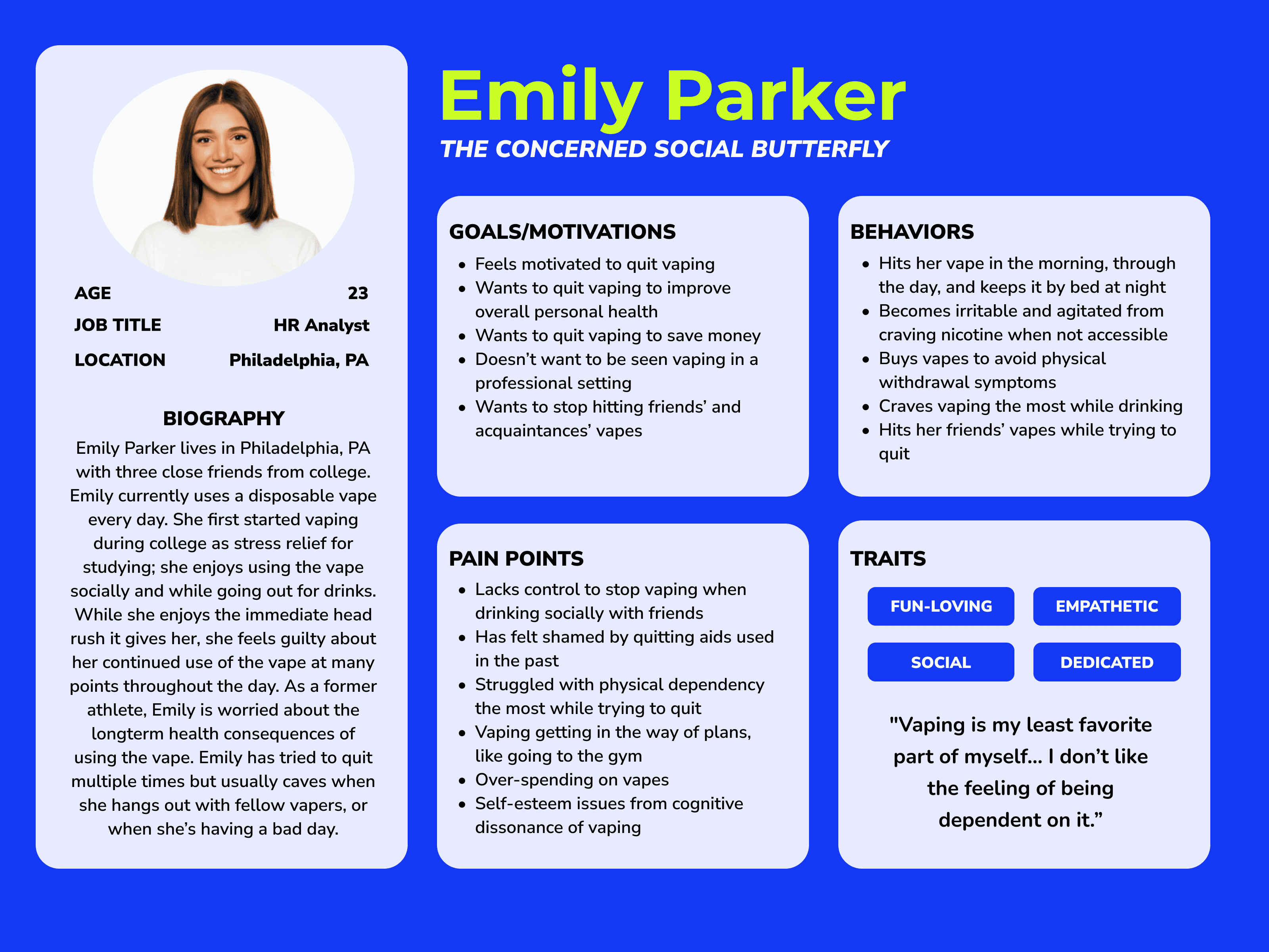
From there, I was primed to create my user persona ->, which is a vital step in the UX design process as it helps inspire empathy in the user group’s current needs, likes, and pain points. I transferred data points from my affinity map and made sure to weave in anecdotal stories collected from my interviews.
Visualizing our findings to better empathize with our user group's desires, actions, and pain points.
PERSONA
See More
EXPERIENCE MAP
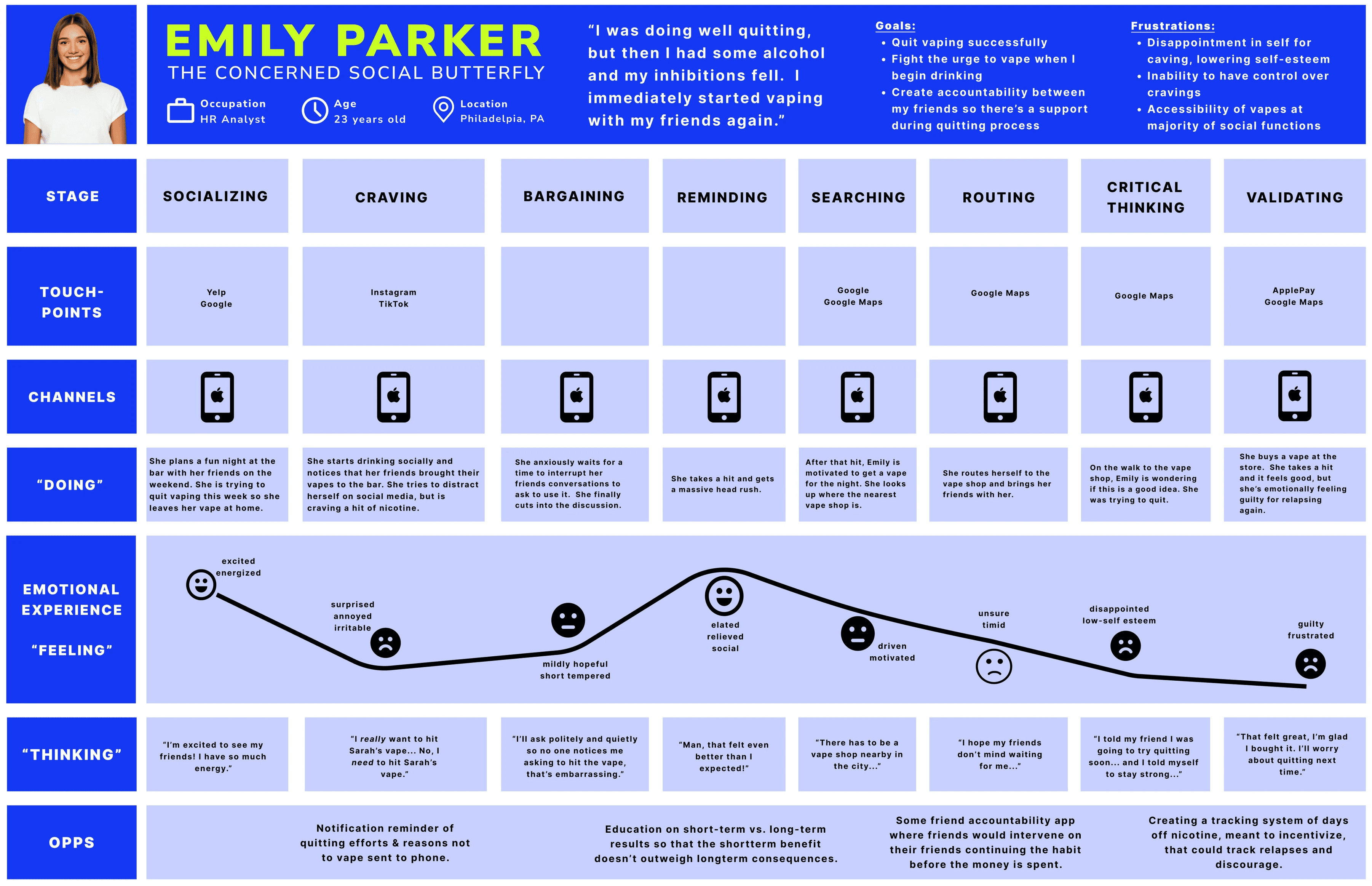
Mapping the user's current emotional experience with quitting vaping and pinpointing potential opportunities for design intervention.
Because all of three interviewees expressed difficulty not vaping while drinking and in social settings with friends, the experience map -> shows my persona relapsing their quitting process after a night of drinking.
See More
REVISED “HOW MIGHT WE” QUESTION
How might we create a space for young adults who wish to quit vaping to connect in order to incentivize them to quit once and for all?
See More
Before I could begin to ideate potential functions included in my app, I created 30+ user stories → based on my persona’s desires, needs, and current experiences. I sorted my user stories into epics based on common functionality, ultimately choosing “Socializing & Communication” as my main epic.
Defining potential functions of our digital solution and strategizing on the most impactful path to solve our problem.
USER STORIES | CHOSEN EPIC
See More
“As a young adult trying to quit vaping, I want to quit with a friend/loved one so that I have accountability to stay off vaping.”
“As a young adult trying to quit vaping, I want to connect with friends about their quitting journey so that we can keep each other accountable.”
“As a young adult trying to quit vaping, I want to connect with friends about their quitting journey so that we can keep each other accountable.”
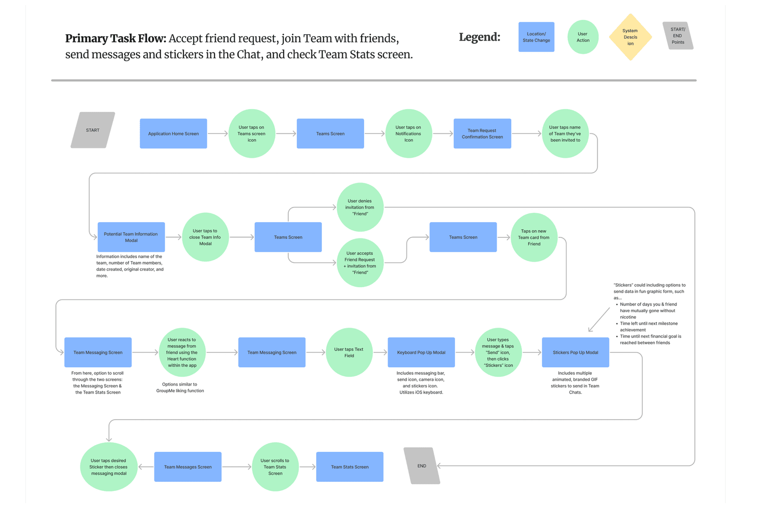
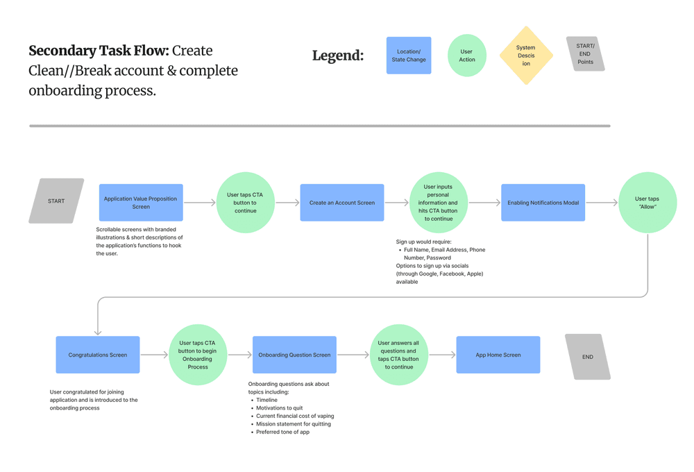
I used my user stories and persona to create a primary task flow -> and secondary task flow -> through my application.
Determining the task our persona is trying to complete and how they might navigate through the technological design.
PRIMARY & SECONDARY TASK FLOWS
See More
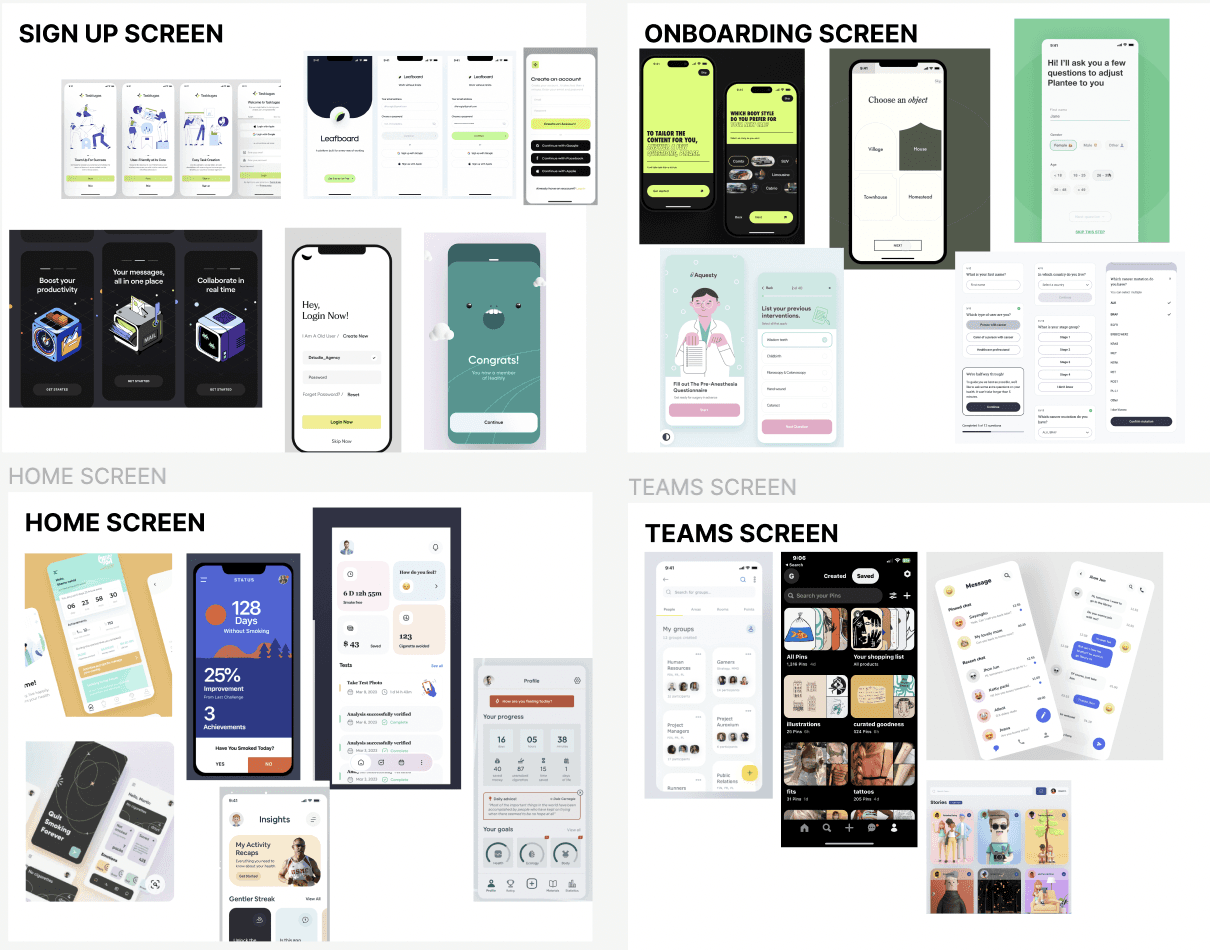
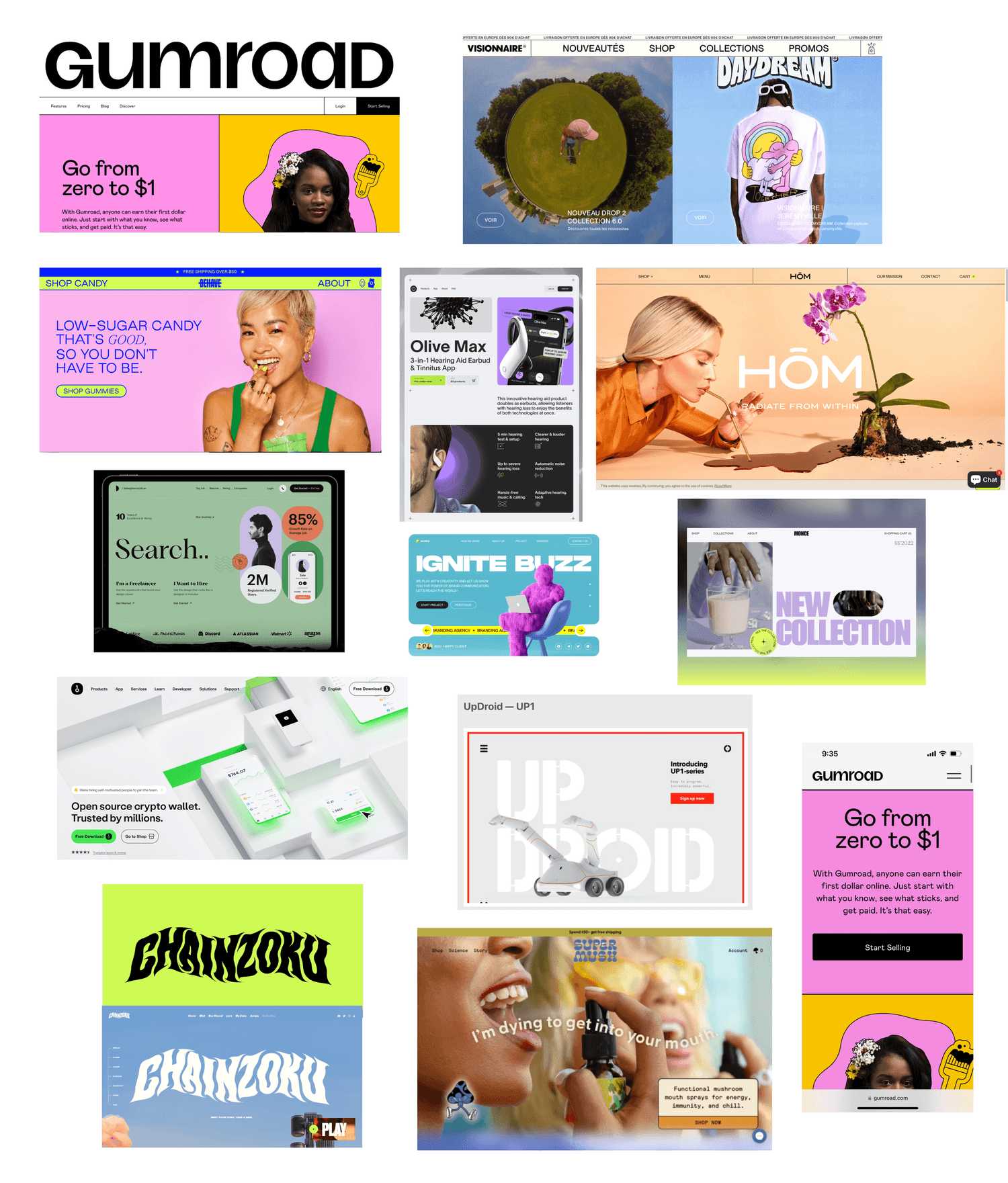
UI INSPIRATION BOARD
From my task flow, I determined seven major screens I’d need to design in order for my persona to successfully navigate through the application. I sourced inspiration for each screen and built out a UI inspiration board -> that I continued to reference throughout the process.
Pulling UI inspiration and putting pencil to paper to best imagine how our digital solution will be structured & presented.
UI INSPIRATION BOARD | SKETCHES | WIREFRAMES
See More
SKETCHING
Shifting into ideation, I drew various exploratory sketches -> then refined them into solution sketches to reference while creating my initial wireframes.
See More
WIREFRAMING
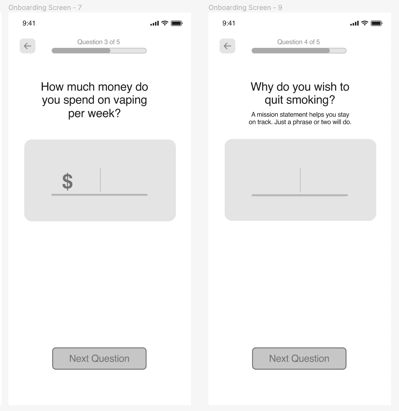
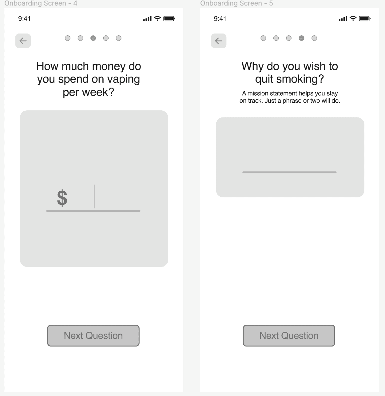
From my solution sketches, I shifted into digital ideation, creating my lo-fi and mid-fi wireframes. The solution sketches acted as a blueprint for each screen's design, with slight alterations made.
See More
Journey from UI inspiration to solution sketches to wireframes…
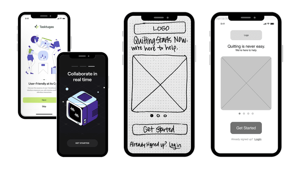
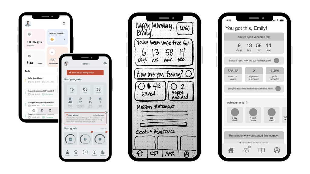
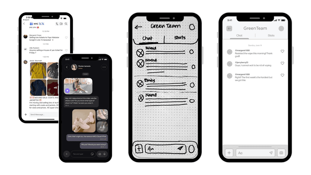
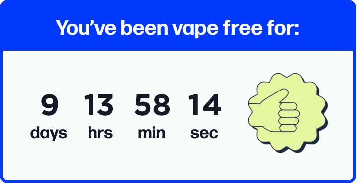
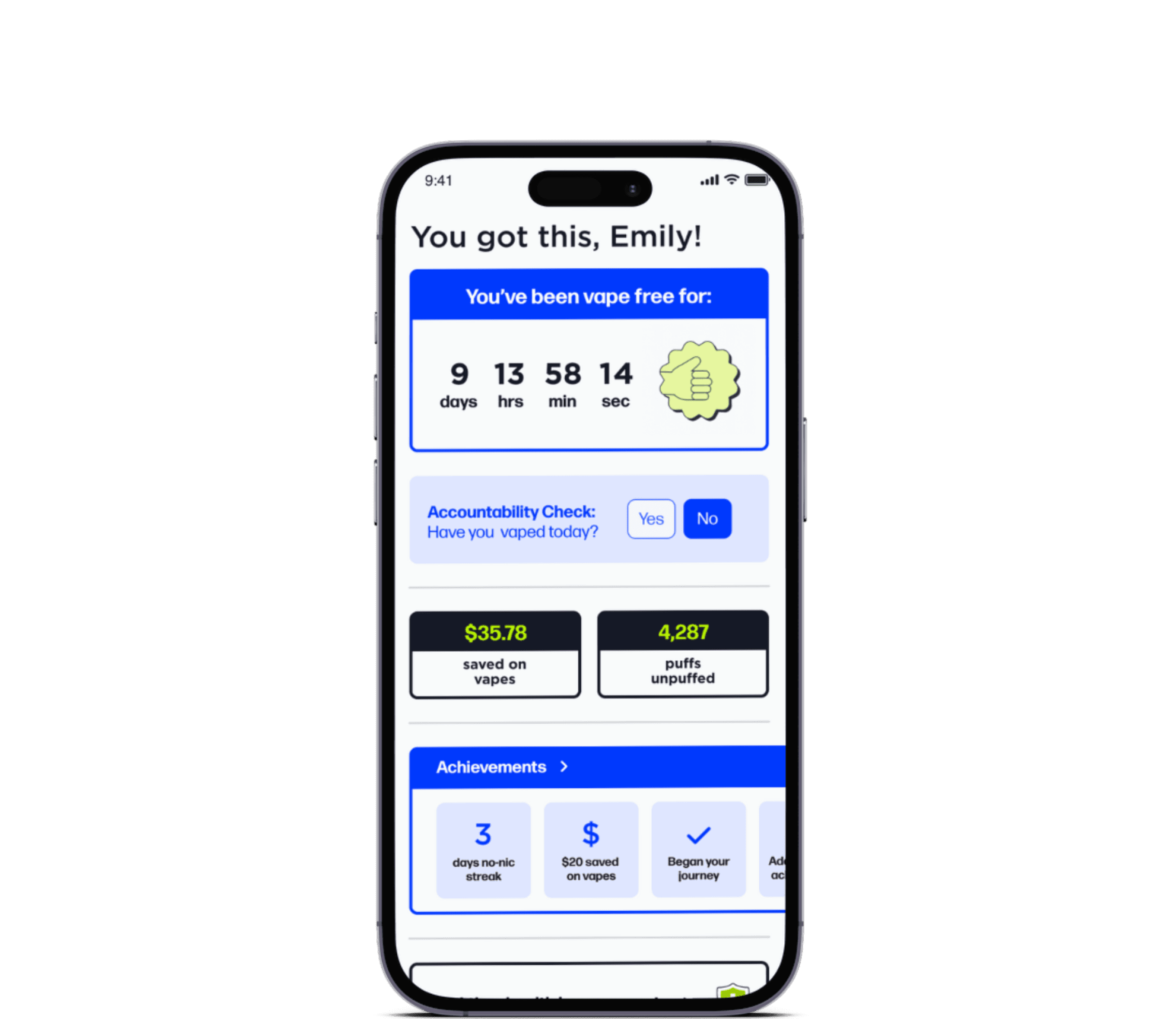
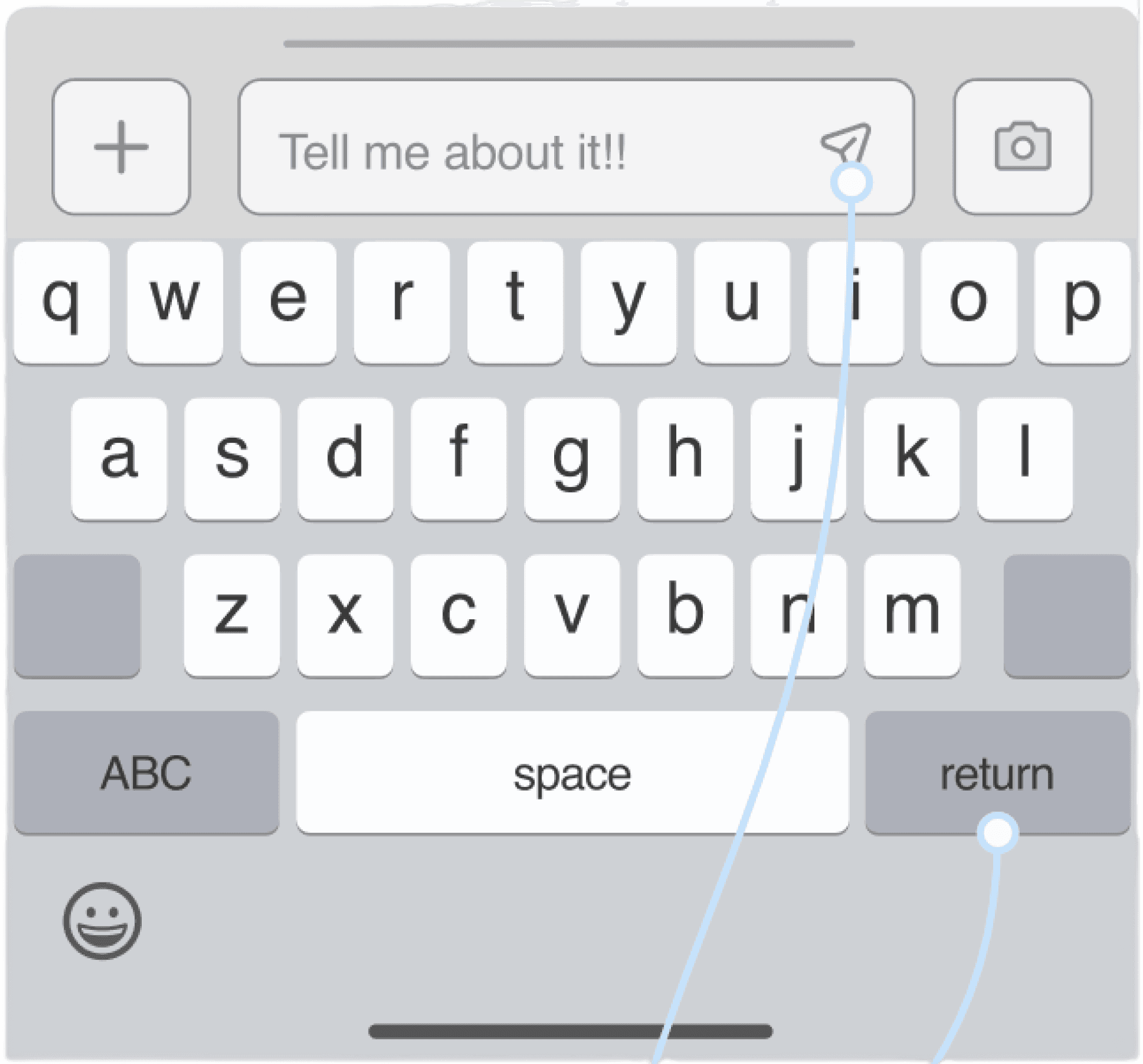
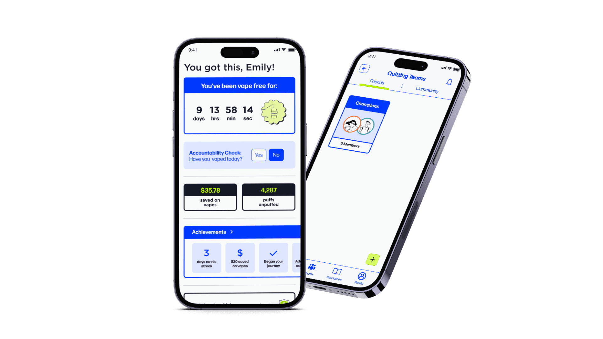
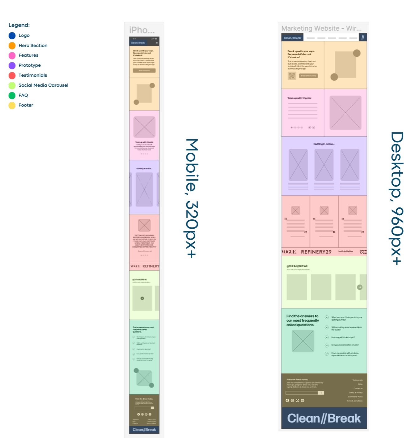
After establishing brand guidelines and constraints, I injected color to my wireframes, transforming them into a polished, high-fidelity prototype. During this process, I strategically revised the wireframes, adjusting the information hierarchy on the home screen and optimizing spacing for better usability.
Creating a prototype emphasizing accountability and socialization amongst young adults who vape.
HI-FIDELITY PROTOTYPE
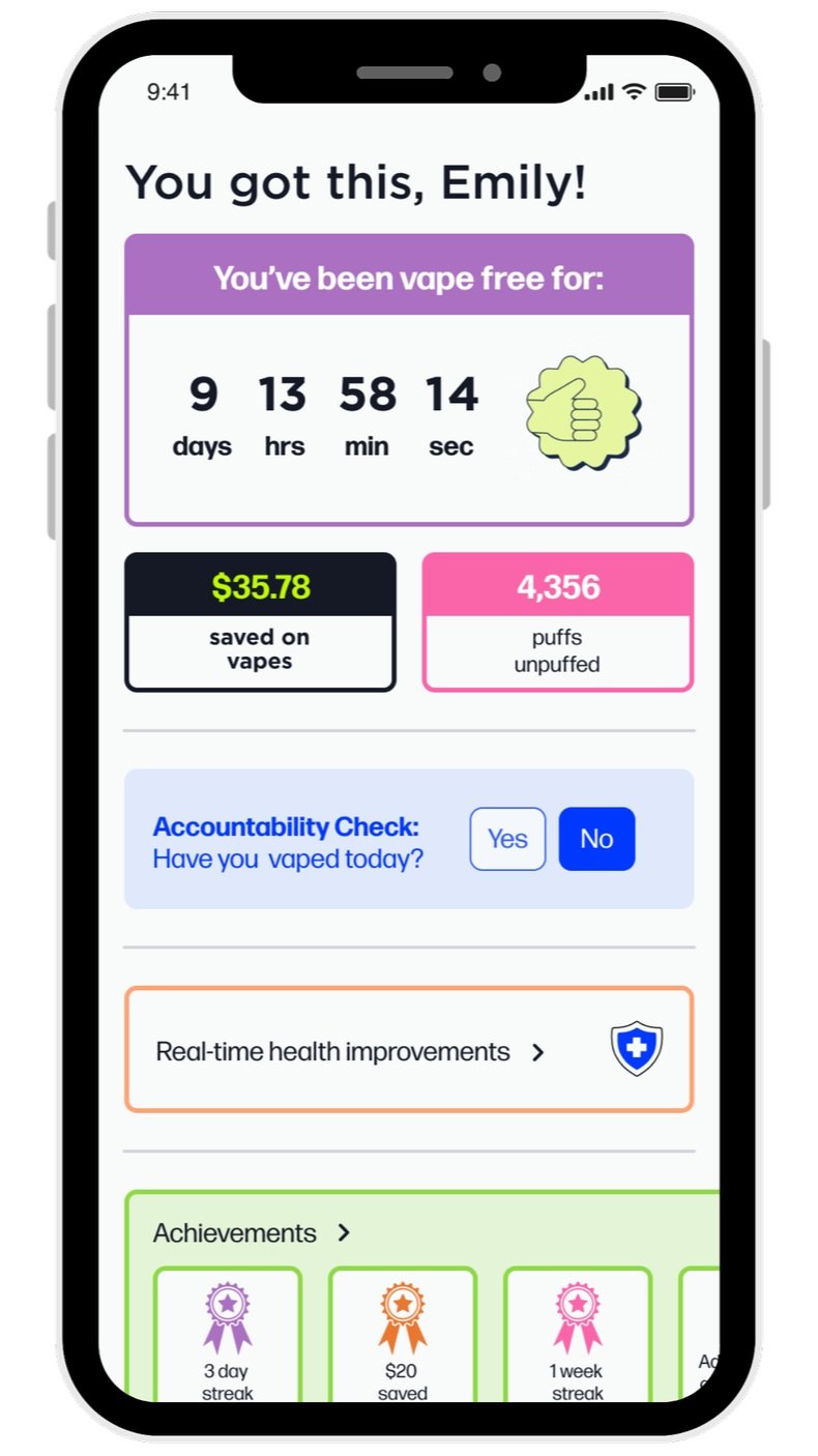
-->
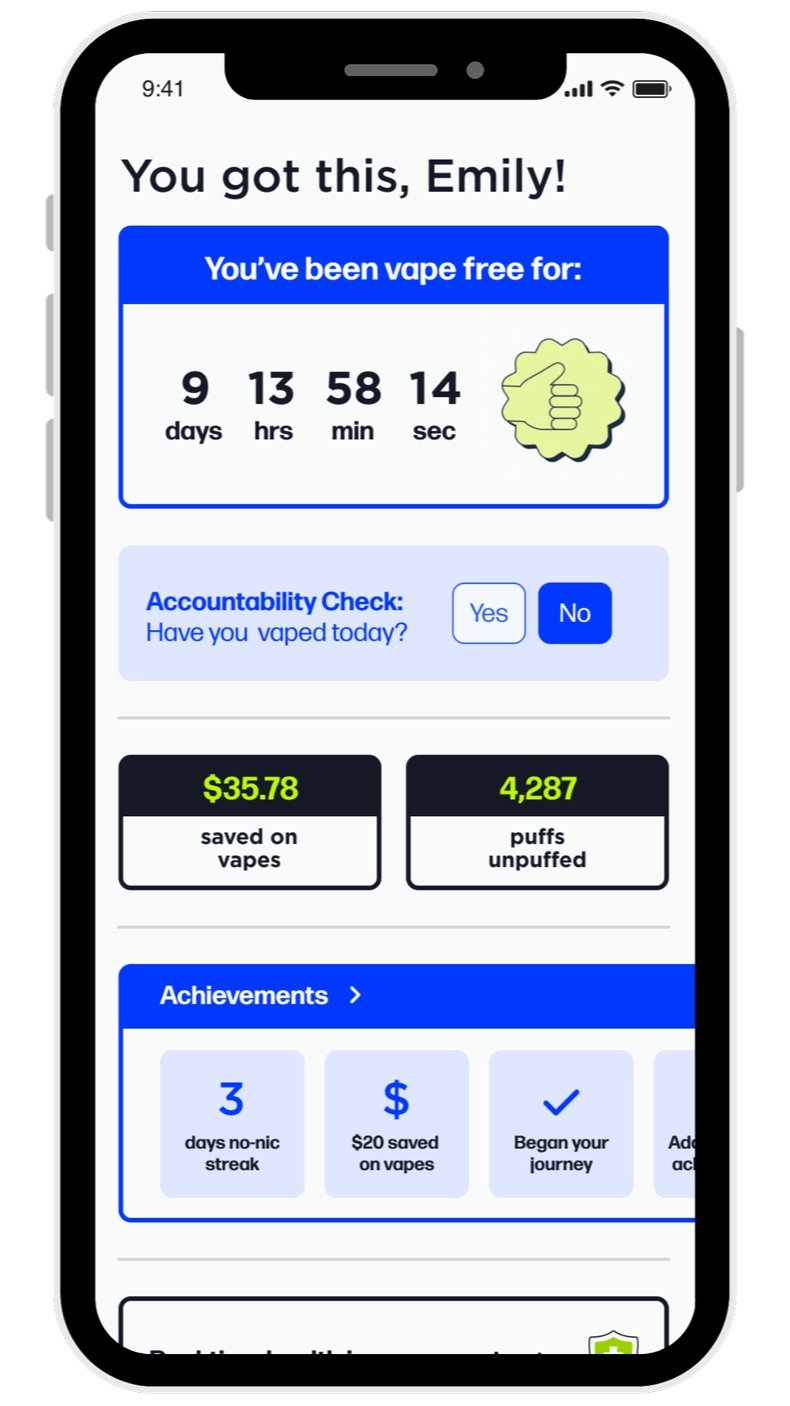
Initially, my prototype incorporated more accent colors than intended, causing a disconnect between the branded onboarding experience and the home screen. To resolve this, I realigned the colors with the primary and secondary brand colors, reserving accent colors exclusively for personalized elements. This adjustment resulted in a more consistent and enjoyable visual experience.
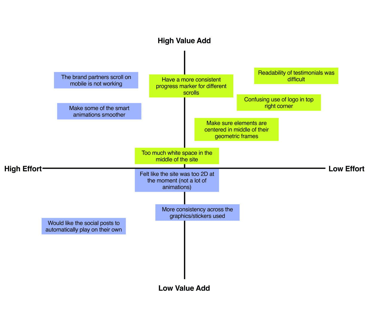
I conducted two (2) rounds of user testing with five (5) participants each. Participants were asked to complete six (6) tasks, varying in levels of "difficulty," or number of steps required to fully complete them. After each round, I charted the issues on prioritization matrices ->.
Conducting usability tests to determine areas of improvement & prioritizing high-value add revisions.
USABILITY TESTING & REVISIONS
See More
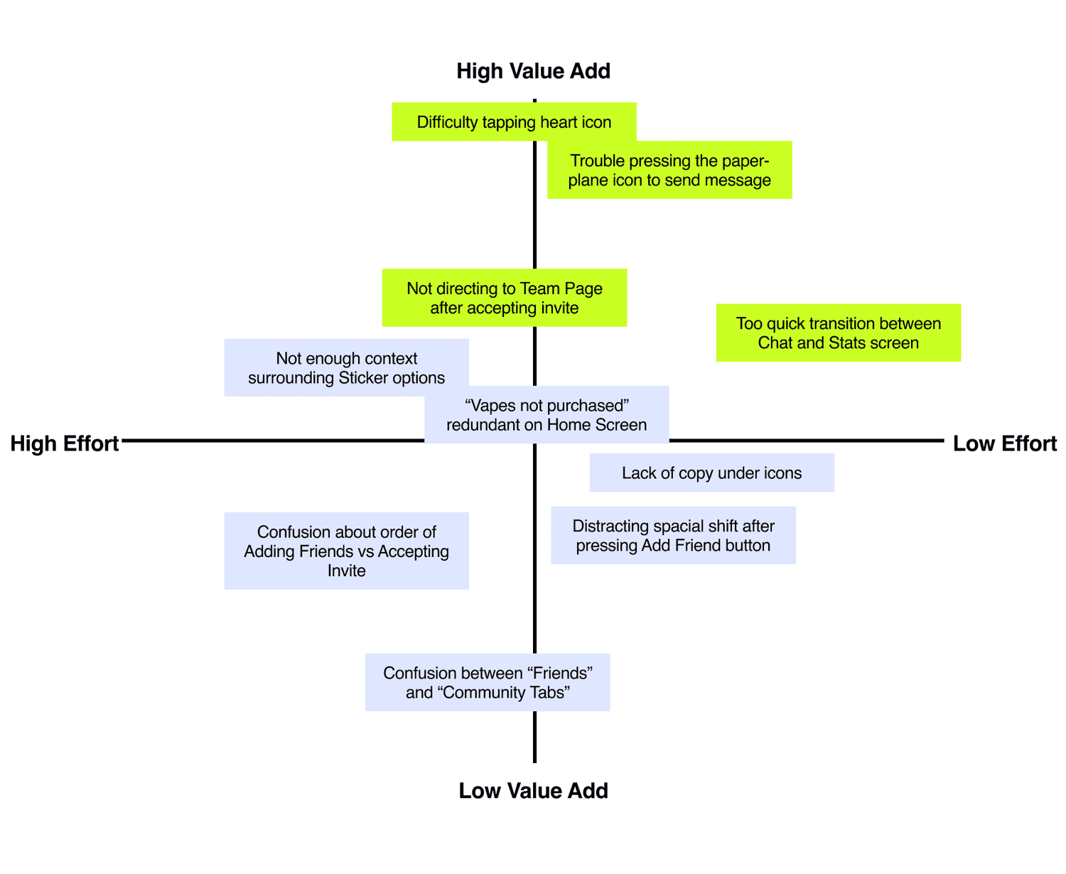
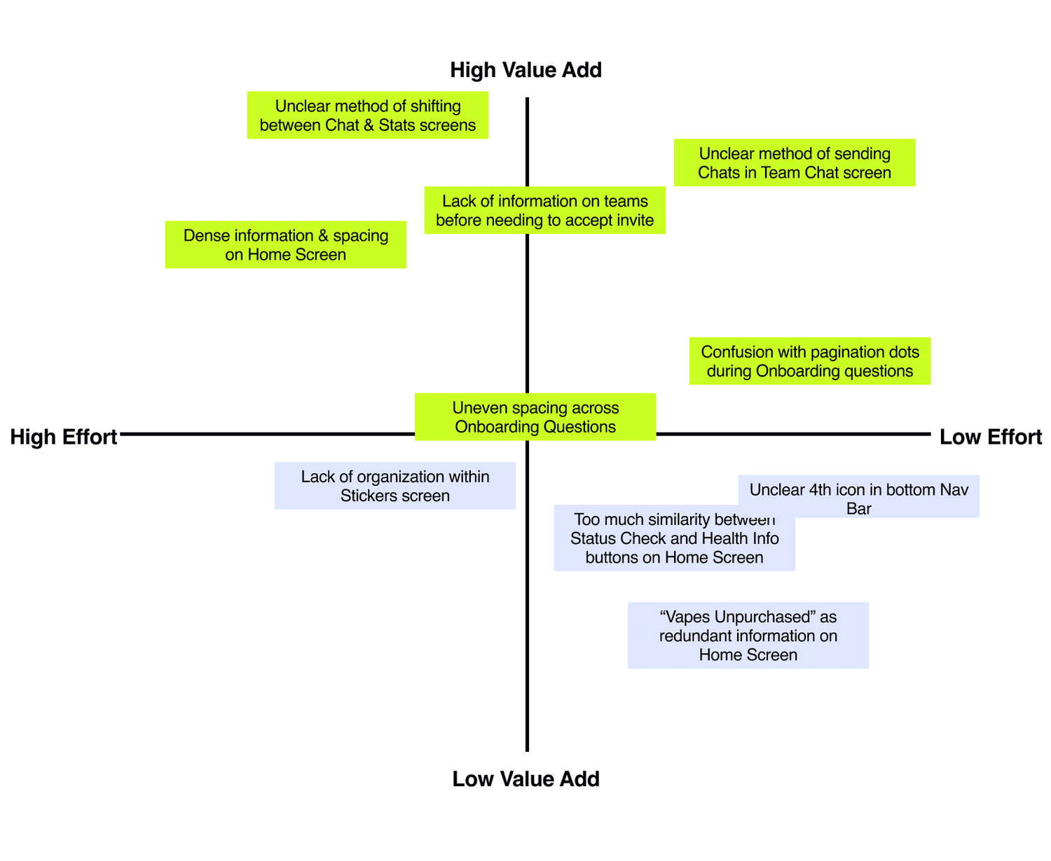
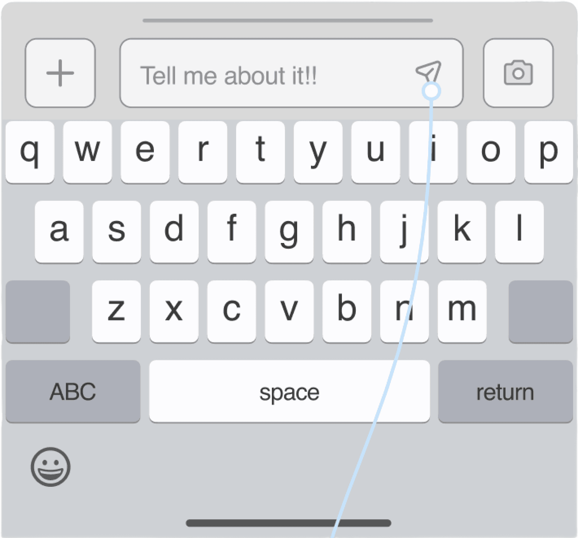
Examples of incorporating user feedback into thoughtful revisions:
ADJECTIVES
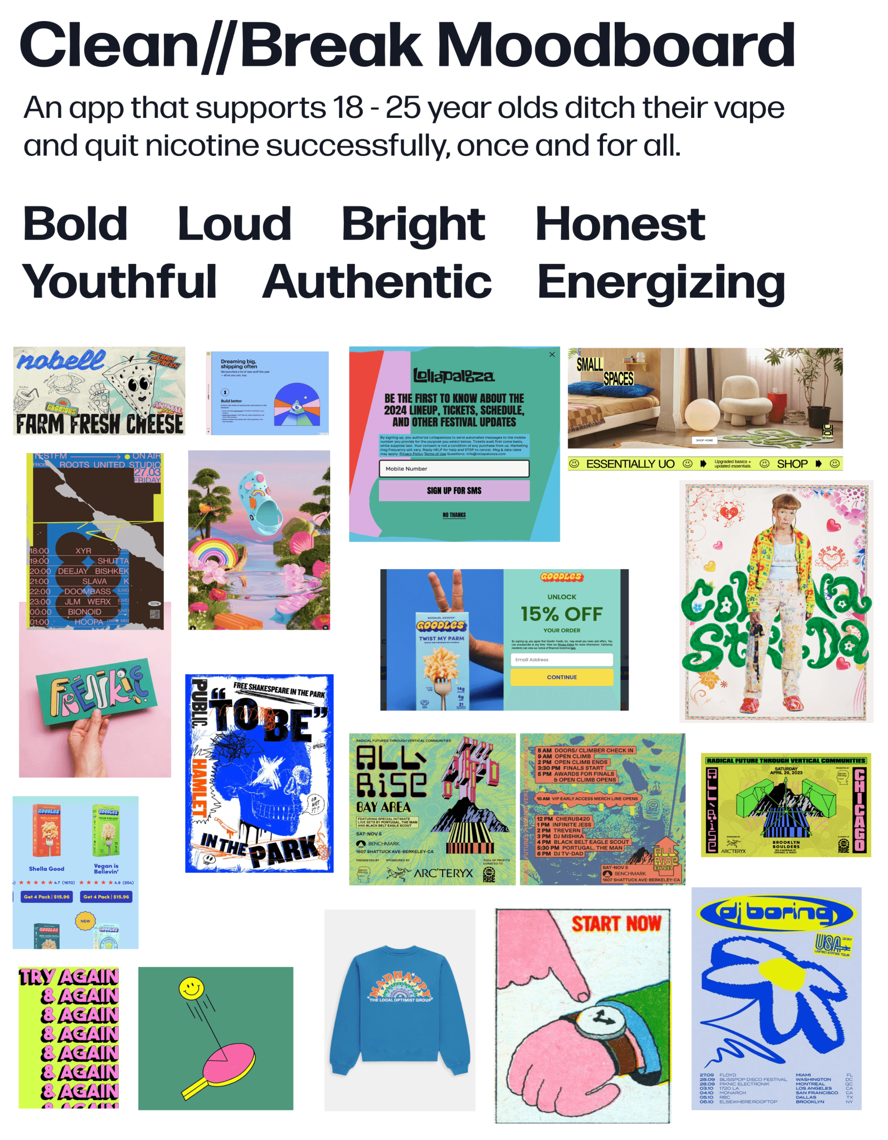
Given the user demographics’ large online presence, I felt it was incredibly important that the UI of the application meet them in their comfort zone of bold, colorful, youthful design. I first developed a list of key adjectives to describe the brand, leveraging a “More A than B List” to decide which adjectives best described my application.
Designing a bold, youthful style guide for our target user group: young adults who vape (ages 18 - 25).
VISUAL BRAND IDENTITY
MOODBOARD
From there, I created a moodboard, following the ideals of the authentic, energizing, bold user.
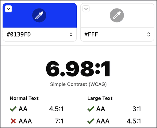
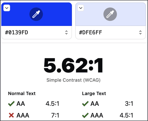
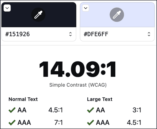
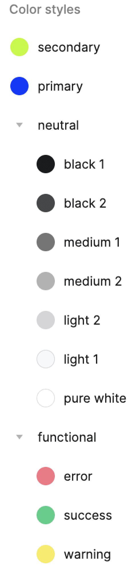
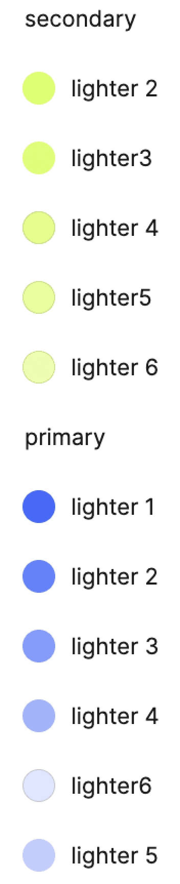
COLORS
I selected royal blue as the primary color from the mood board, complemented by neon green as the secondary color. I determined their usage using the 60:30:10 method. These color choices were defined as styles in Figma for streamlined design consistency, facilitating collaboration with other designers and developers.
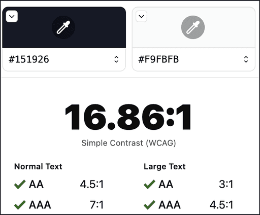
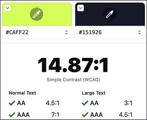
ACCESSIBILITY
Each color was tested against WCAG 2.0 Level AA standards. To conform to these metrics, that means that the application is usable and understandable for the majority of people with or without disabilities. The meaning conveyed and the functionality available is the same.
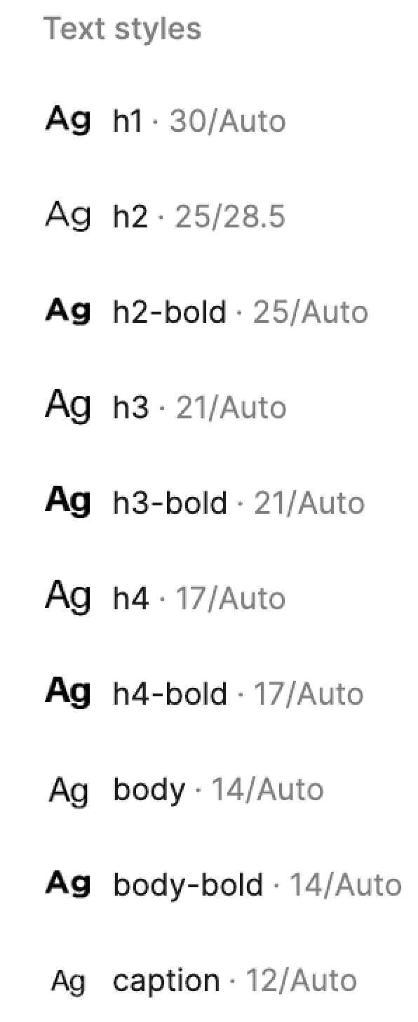
TYPOGRAPHY / TEXT STYLES
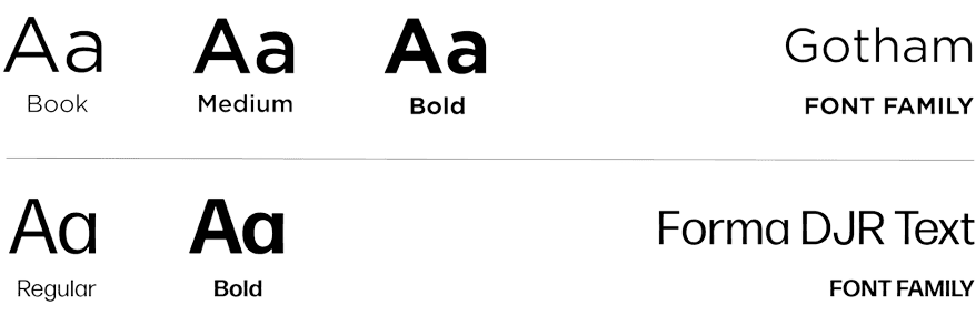
Across the moodboard, clean, sans serif, bold typography was being used in many similar designs. I used Adobe Fonts to peruse many options, ultimately landing on Forma DJR Text and Gotham font families.
See More
ORGANIZATION
I added these brand guidelines into my Figma file as text and color styles. This helped to streamline the design process by eliminating the need to assign text and color manually.
See More
BRAND NAME & LOGO
Per my user interviews, young adults preferred transparency and quitting messaging they can personally connect with. They understood that quitting was the best move and would improve their life. As such, I landed on the name Clean//Break.
See More
BLACK & WHITE WORDMARK
Clean
/
/
Break
Clean
/
/
Break
COLORIZED WORDMARK
Clean
/
/
Break
Clean
/
/
Break
/
/
iOS APPLICATION ICON
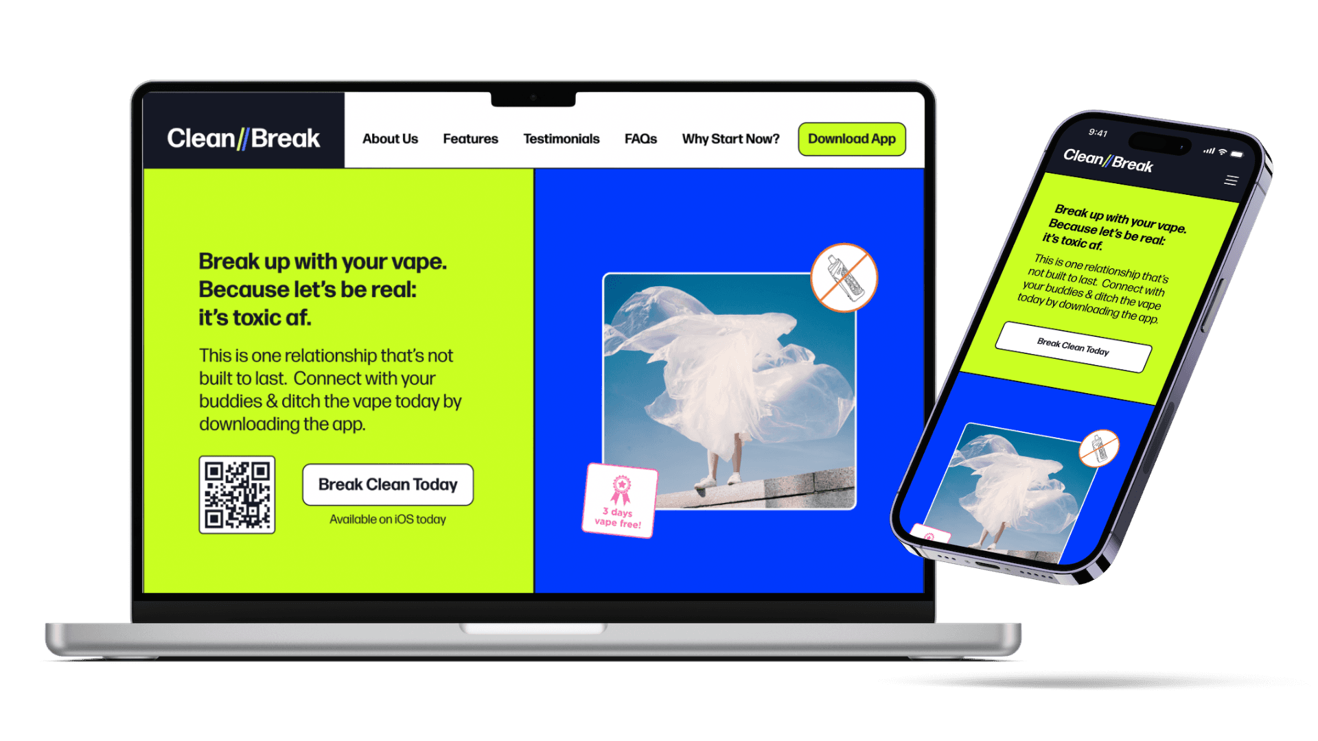
A product can be the perfect solution, but first people must know about it first. So, I created a responsive marketing website to “sell” my application to potential users.
Designing a marketing website to explain Clean//Break’s mission and drive user acquisition.
MARKETING WEBSITE
Goals for the marketing website include:
✷ Incentivize users to download the application & begin their quitting journey.
✷ Convince users this is a serious issue & requires immediate attention.
✷ Aspire to “make quitting cool again” amongst young adults.
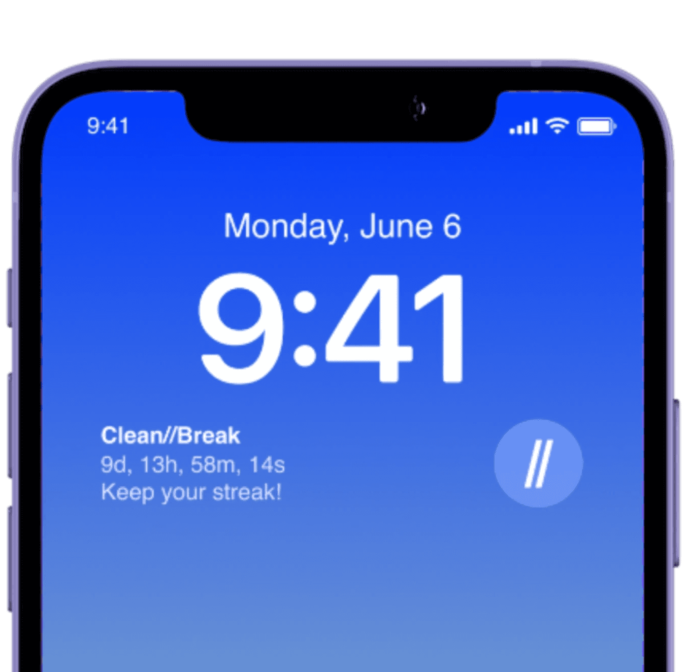
Succumbing to vaping can take less than a minute, so I wanted an option for my users to access my application ASAP and in times of crisis. So, I created an iOS widget extension of Clean//Break that automatically routes the user to the homescreen of the application.
Designing an iOS widget to make Clean//Break easily accessible in times of need.
iOS WIDGET DESIGN
There was one question I returned to throughout the design process: "How might mass scale usage of this app affect young adults at large?" In my eyes, a future where young adults feel empowered and prepared to ditch the vape is a healthier and happier one. There are massive gains for a person’s financial, cognitive, and physical well-being the moment they quit vaping – and Clean//Break gives them a space to do so.
Blue sky thinking: Imagining how mass scale use of this application could positively change society.
DESIGN IMPACT & LOOKING FORWARD
Recap of the knowledge gained throughout this process and how I plan to apply my new skills moving forward.
KEY LEARNINGS
Utilizing AI plug-ins helps level up designs.
Throughout this design process, I researched plug-ins to use during all stages of creating my product. Some of my notable favorites were Iconify, Redlines, Stark Accessibility Tools, and Mockuuups Studio, amongst many others.
I received feedback during my testing sessions to create more space in my designs. I am focusing on condensing copy and leaning on negative space as an information hierarchy tool.
Simple is powerful.
Organization leads effective design.
By ensuring all my colors and text styles were set in my Figma file, my elements were organized into a UI design library, and my layers were properly ordered and named, the design process was streamlined and enjoyable.